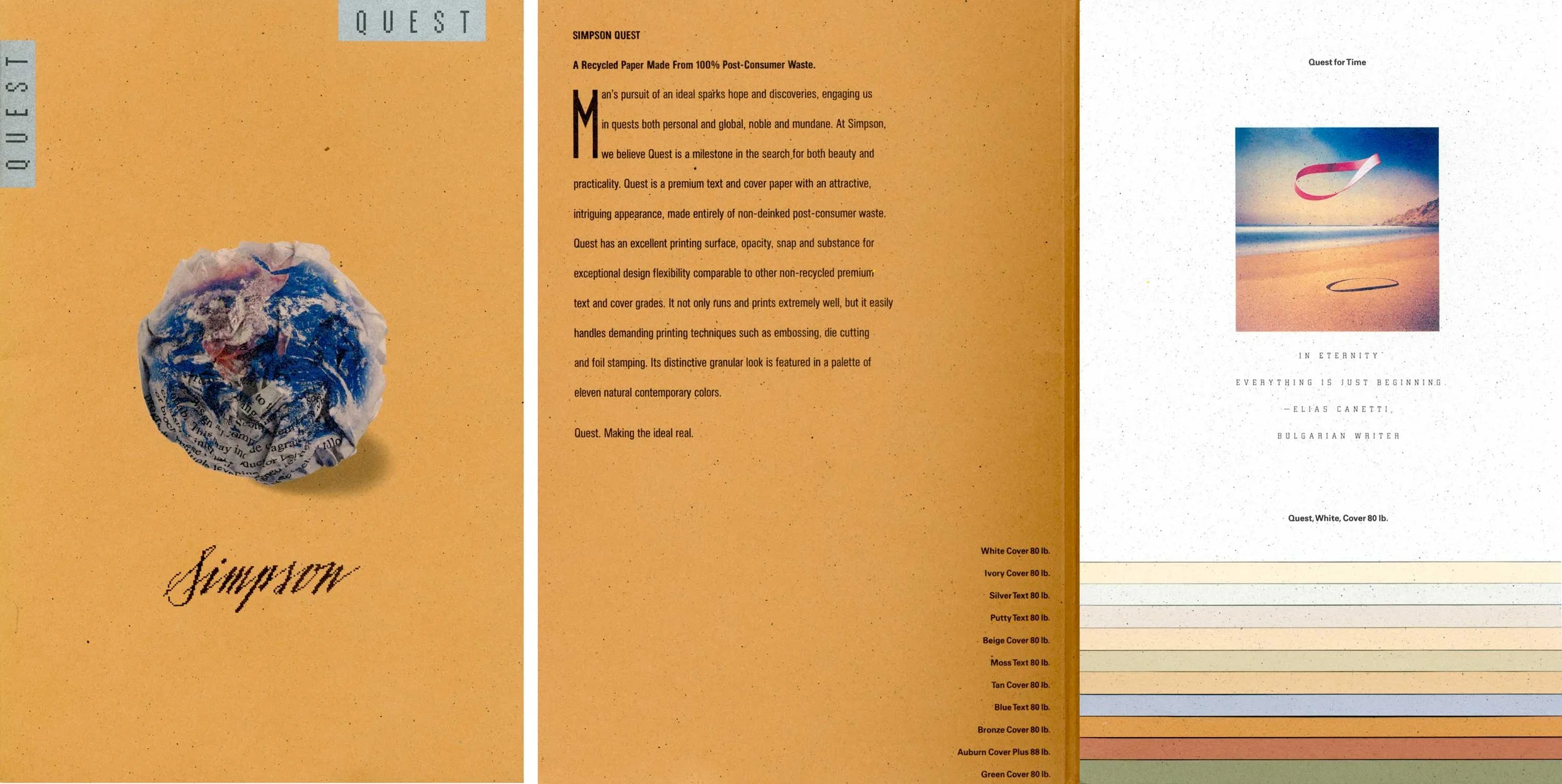
• Home
  • Portfolio
  • Blog
  • About Us
  • Results
  • Contact

A R T I F A C T

Design and Marketing

  • Home
  • Portfolio
  • Blog
  • About Us
  • Results
  • Contact

INNOVATION FOR THE ENVIRONMENT

SIMPSON QUEST
Product Design and Promotional Campaign
Simpson Paper Company 1991
Product Strategy: Gary Snider, Simpson
Product and Supply Chain Development: Tim Seifert, Simpson
Collateral Design: Kit Hinrichs, Pentagram SF
Color Palette Design and Marketing Communications: Dave Van de Water, Simpson

Simpson Quest was the first premium text and cover paper made from 100% post-consumer waste paper.

It required the development of a brand new supply chain that separated high quality office waste — computer printouts, office documents and such — from other trash generated by large corporations and financial institutions. Trash Dealers throughout the midwest were recruited to install recycling bins inside offices and train staff to keep the paper waste segregated.

Designed for a specific paper machine at Simpson's Vicksburg Mill near Kalamazoo Michigan, the project took over a year to complete, with repeated trials needed to perfect the supply chain and process flow within the mill.

The grade was launched in 1991, just as the early 90's recession was slowing the paper market. To ensure the new grade was embraced by paper merchants, Gary Snider, head of marketing and business planning, asked us to develop an aggressive promotional campaign that was upbeat and inspirational, while setting the grade apart for its promise of environmental benefits.

To promote the grade, we asked Kit Hinrichs, who had created the highly successful promotion "American Naturalists" for Evergreen Text, to design a lush oversized brochure, researched and written by Delphine Hirasuna, featuring profiles on technological and social innovations illustrated by leading American illustrators. Each spread described a unique development that promised to improve the quality of life in society. Original artwork was reproduced on the 11 shades of the grade in a waterfall pattern that showed the warm, earthy tones of the color palette.

The palette design was a bold departure from the existing array of American text and cover grades, which still reflected the optimistic post-modern trend of the 1980’s with bright pastels influenced by events like Sussman Prezja’s ‘84 Olympics, the Miami Vice TV series and Robert Venturi’s architecture. By the time the 20th anniversary of Earth Day arrived, American design had moved strongly toward a natural environmental aesthetic as characterized by the popular series Twin Peaks, and marketers like Patagonia and The Nature Company.

In addition to the earthy palette, the surface appearance of Quest featured a visual texture of fine specks dispersed through the sheet, somewhat evocative of sandpaper. Serendipitously, inspired by a similar Washi paper we had found from Japan, our papermakers had been unsuccessfully trying to create the same look using other fiber inclusions. However, when the fused carbon toner on reclaimed laser printouts was broken up in the pulper, it produced exactly the right visual texture. That lucky twist meant we could avoid the added step of de-inking printed waste, reducing Quest’s environmental footprint even further.

The result was a highly successful product line that generated millions in sales during a challenging economic period. All in all, Quest was a textbook case of capturing lightning in a bottle.

Simpson Quest Launch Promotion

Quest Launch Campaign Materials by Kit Hinrichs, Pentagram SF

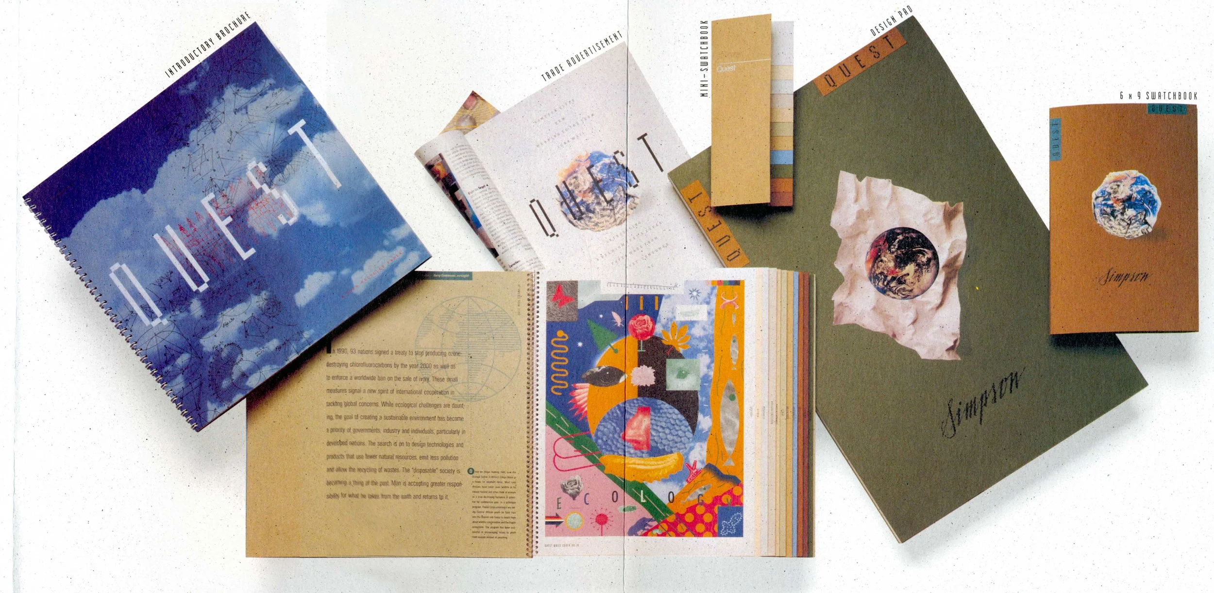
Simpson Quest Launch Materials by Kit Hinrchs, Pentagram SF

Simpson Quest: Agriculture

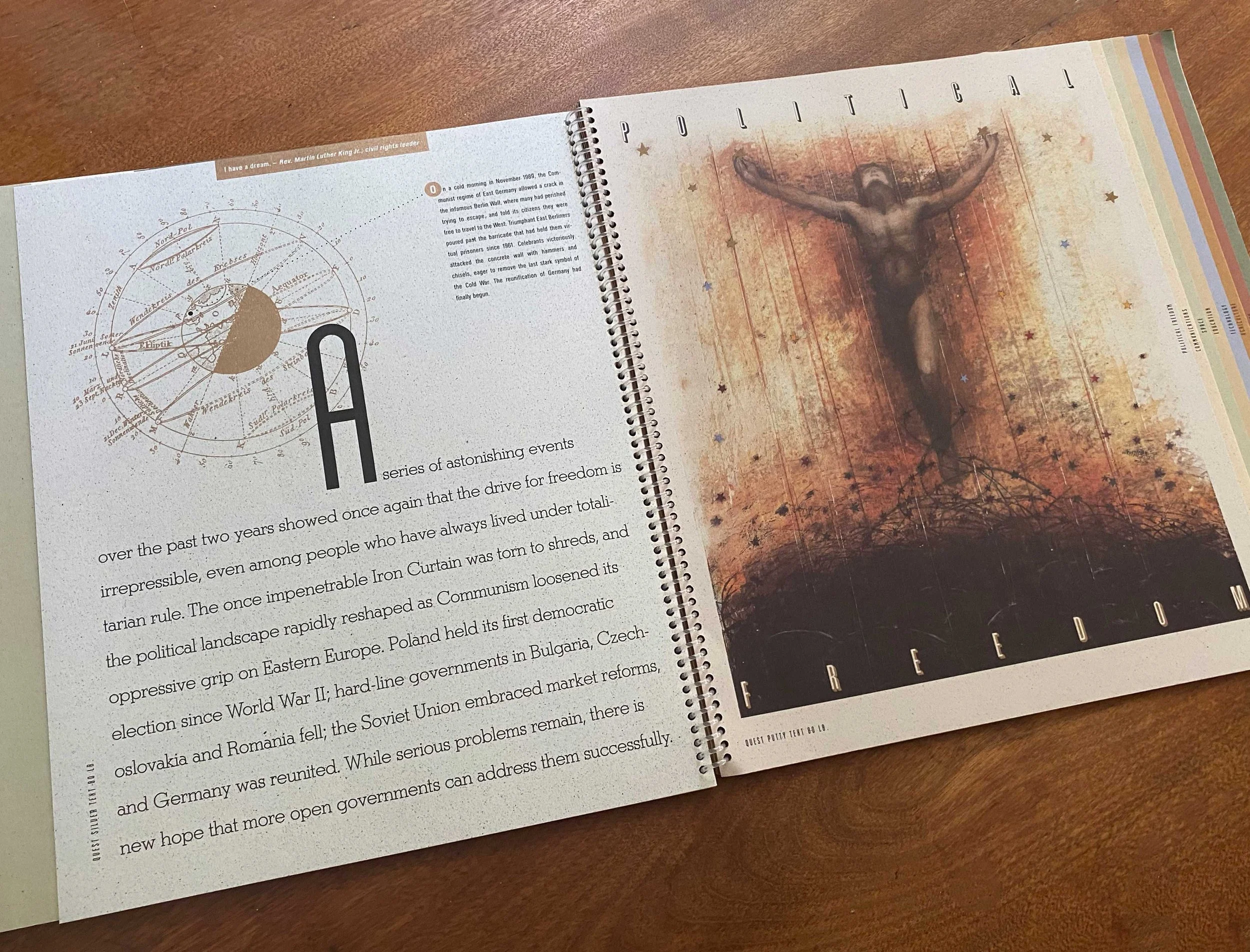
Simpson Quest: Political Freedom

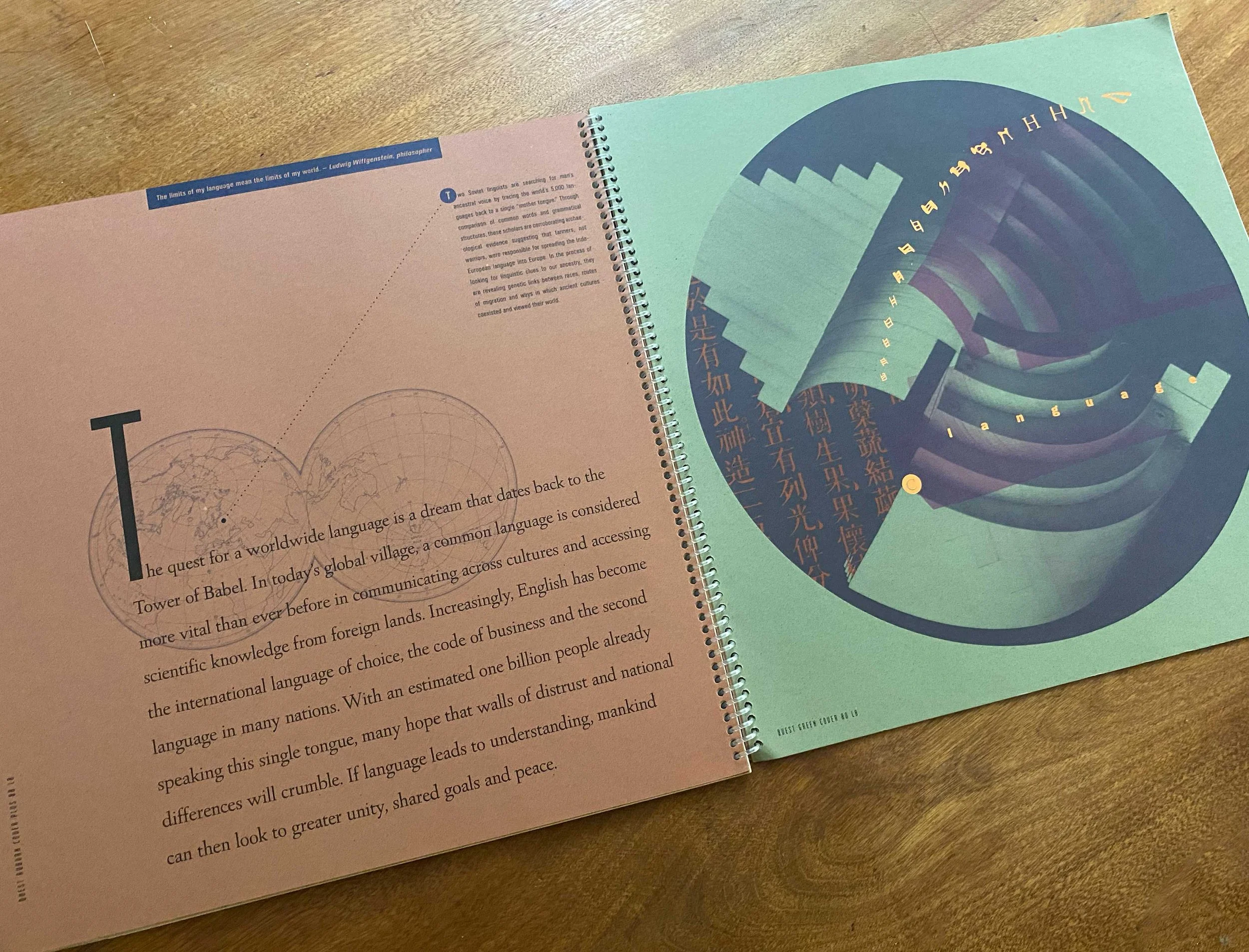
Simpson Quest: Language

Simpson Quest: Health

Simpson Quest: The Arts

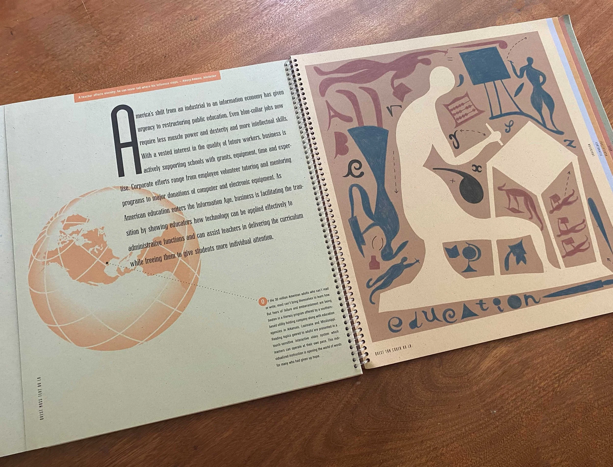
Simpson Quest: Education

Tuesday 11.18.25
Posted by Dave Van de Water
 

Celebrating a pair of American masters

ALI: Behind the Lens with an American Legend.28 pages 10"x14" softcover. Published on the occasion of the exhibition "I am the King of the World": Photographs of Muhammed Ali by George Kalinsky at the New-York Historical Society 

ALI: Behind the Lens with an American Legend.
28 pages 10"x14" softcover. Published on the occasion of the exhibition "I am the King of the World": Photographs of Muhammed Ali by George Kalinsky at the New-York Historical Society


It was a terrific honor to be asked to design a large format photobook of George Kalinsky's iconic images of Muhammed Ali for his exhibition at the NY Historical Society.

After showing him the large monographs we had designed on the work of Mark Seliger, Steve McCurry and Rodney Smith for Monadnock Paper, George asked if I might create something similar in time for his December opening. It was a tight schedule and the design format took a couple of turns, but the project was hugely rewarding and the book is really impressive. It is now on sale at the Historical Society's museum store.

The biggest puzzle to solve was the size and binding. At first, I planned to run it on 13" x 19" sheets on the Indigo, with a layflat binding similar to the great book on Joan Miro's masonite paintings printed by Francis Atterbury at his Hurtwood Press in London.  Chris Harrold of Mohawk had shown it to me a few years ago and I've always recalled the strong impression it made. 

However, after we sent dummies to George and the Historical Society, he opted to stick with the saddle-stitched binding on the Monadnock books. I wanted to stick with Indigo, so we ran it on a 10000 that can run 20" x 29" sheets at Sandy Alexander in Clifton NJ. Sandy's color guru, Art Bush, did a fantastic job converting an array of images of varying nature spanning George's 50-year career. George made a great decision to keep the book totally black and white and Art employed a few of his secret tricks to create amazingly rich and dense quadtones.

The stock is Ultrawhite Eggshell Superfine Digital, 100 cover with 80 cover for the text. The quality of the toner laying on the surface is something. Looks like it might be carbon black fused to the paper.  

The result is a book that reflects the heavyweight persona of Ali and his long-time friend and photographer. Both true masters of their art.

Saturday 01.14.17
Posted by Dave Van de Water
 

Redesigning Legacy: Mohawk Connects

Mohawk Streamline was one of the largest product design projects I've ever been involved with, as well as one of the more challenging creatively. It integrated the products of 22 paper brands acquired by Mohawk into a much simpler line of 6 major brands. In the process, a range of iconic paper brands were absorbed by the Mohawk brand, including Strathmore, Beckett, Cross Pointe, Georgia Pacific and others.

However, the result was a major elimination of redundant products, significantly reducing the environmental footprint of Mohawk's manufacturing platform as it eliminated thousands of unique product set-ups, each requiring considerable quantities of water, dies and fiber run through the paper machines during product changeovers.

It also allowed designers to navigate more easily between the product offerings, as we organized products along functional and aesthetic lines based on current design trends. It was a complex exercise of integrating fashion with papermaking in pursuit of efficiency and environmental sustainability.

The launch materials and sampling systems were masterfully designed by Michael McGinn’s team at Designframe NY, now known as Standard Issue.

Source: https://www.mohawkconnects.com/design-libr...
Friday 11.18.16
Posted by Dave Van de Water
 

Design and Print creates Impact

A cornerstone of The DPI Project is a design journal beautifully printed on Monadnock Astrolite. It features photos of iconic brands including Coca-Cola, GMC Truck, Harvard, Formica and Roberto Coin. Photographers include Arthur Meyerson, Terry Heff…

A cornerstone of The DPI Project is a design journal beautifully printed on Monadnock Astrolite. It features photos of iconic brands including Coca-Cola, GMC Truck, Harvard, Formica and Roberto Coin. Photographers include Arthur Meyerson, Terry Heffernan, Scott Dorrance and Antfarm.

As social media and internet marketing floods the inboxes and browsers of American consumers, print communication has never been more important for reaching audiences that are educated, discerning and committed to sustainability.

“The DPI project is dedicated to promoting best practices in print design.”

Enlightened corporations and non-profits are experiencing healthy returns on their marketing investment by leveraging the impact of well-designed materials printed on premium papers. It requires a targeted strategy, but no other media provides the same degree of engagement and retention.

In an effort to increase awareness for the marketing impact of fine printing, we were commissioned by our friends at Monadnock Paper to create a promotional campaign centered around their exceptional line of ultra-premium uncoated papers. The objective is to promote the sharing of best practices among the printers, designers and brand managers who are leaders in the print design industry in the United States.

The DPI Project is both a forum for the exchange of information and a gallery to showcase examples of best practices in print design. Through a print journal titled Single Image, a design blog and local events with designers, paper companies and printers, both experienced and novice designers, printers and brand marketing professionals can learn and share ideas, design inspiration and strategies for helping organizations succeed through the power of print marketing. 

You can find the program at designprintimpact.org, and we would love to hear from anyone who would like to contribute to the effort.

DPV / East Arlington VT

Sunday 02.08.15
Posted by Dave Van de Water
 

Mentors and Heroes: Mark Seliger and Rusty Truck

character cover.jpg
Mark Seliger on Caress and Dulcet, presented by Monadnock Paper Mills. Printed by Williamson in Dallas, it is one of the finest examples of printing on uncoated paper you will ever find.

Mark Seliger on Caress and Dulcet, presented by Monadnock Paper Mills. Printed by Williamson in Dallas, it is one of the finest examples of printing on uncoated paper you will ever find.

A few years ago, we had the privilege of designing a terrific monograph on the work of Mark Seliger, the legendary photographer for Rolling Stone. I could write an entire post on the exceptional artistry and craftsmanship of his images, but to be honest, his music is even better.

Seliger's band is called Rusty Truck, and they've released two gorgeous albums of lyrical, bluesy country tunes written by Mark and richly colored by his velvety twangy voice. Titled Broken Promises and Kicker Town, they include collaborations with friends Mark made while shooting spreads for RS, including Lenny Kravitz, Jakob Dylan, Gillian Welch, Sheryl Crow, and Willie Nelson.  One of my biggest regrets is that his busy shooting schedule prevents them from touring very often.

Rusty Truck is a standard fixture on our road trip playlist.  You should definitely check them out.

DV / East Arlington VT

Sunday 01.25.15
Posted by Dave Van de Water
 
Newer / Older